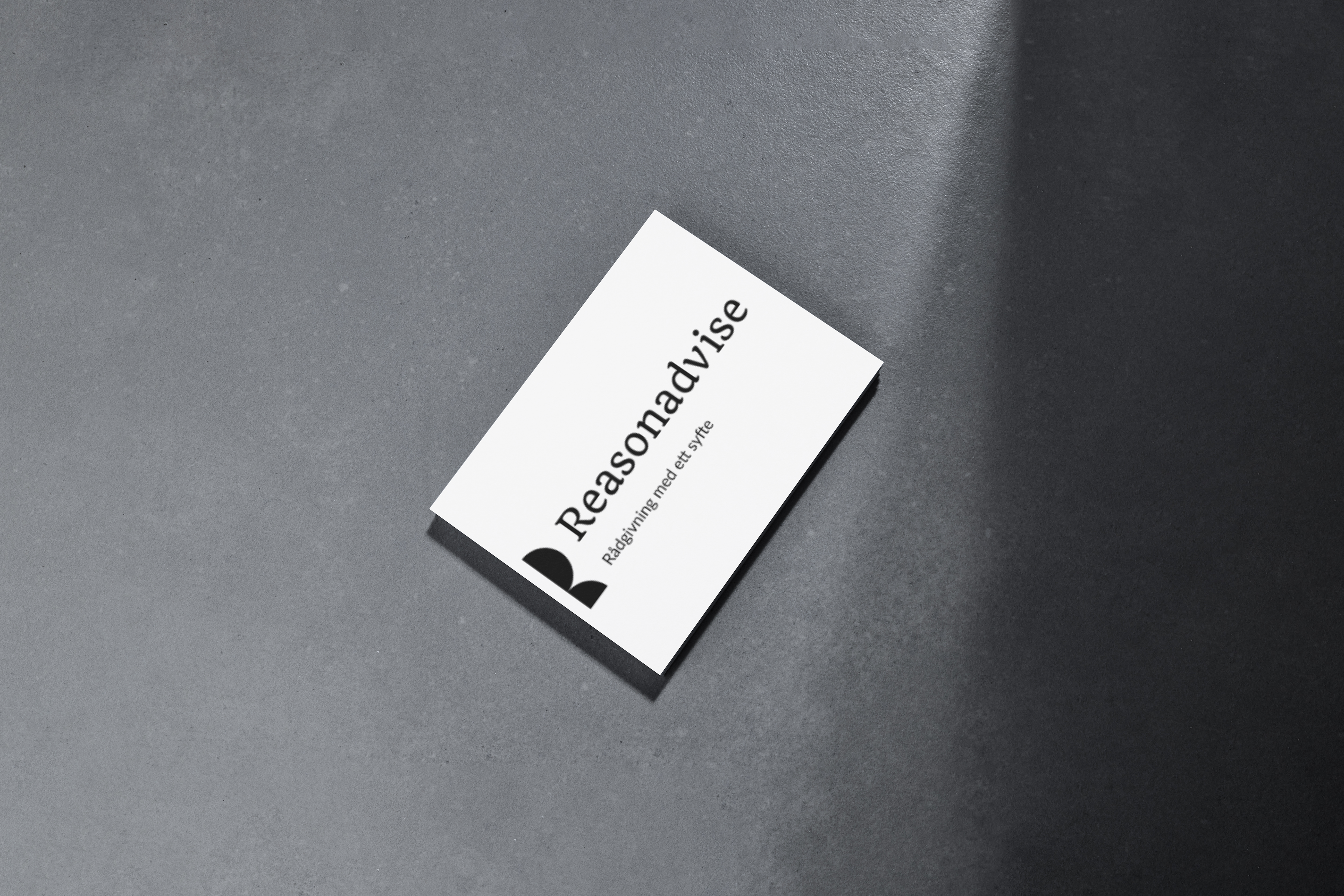
Logo Concept
I wanted this logo to feel clear, confident, and adaptable. The geometry gives it structure and stability, while the open negative space keeps it approachable and flexible.
It works in any size and setting, from a business card to a big-screen presentation, and its simplicity is very much on purpose. Just like good consulting boils complex problems down to clear actions, this mark keeps only what’s essential, and communicates it with clarity.
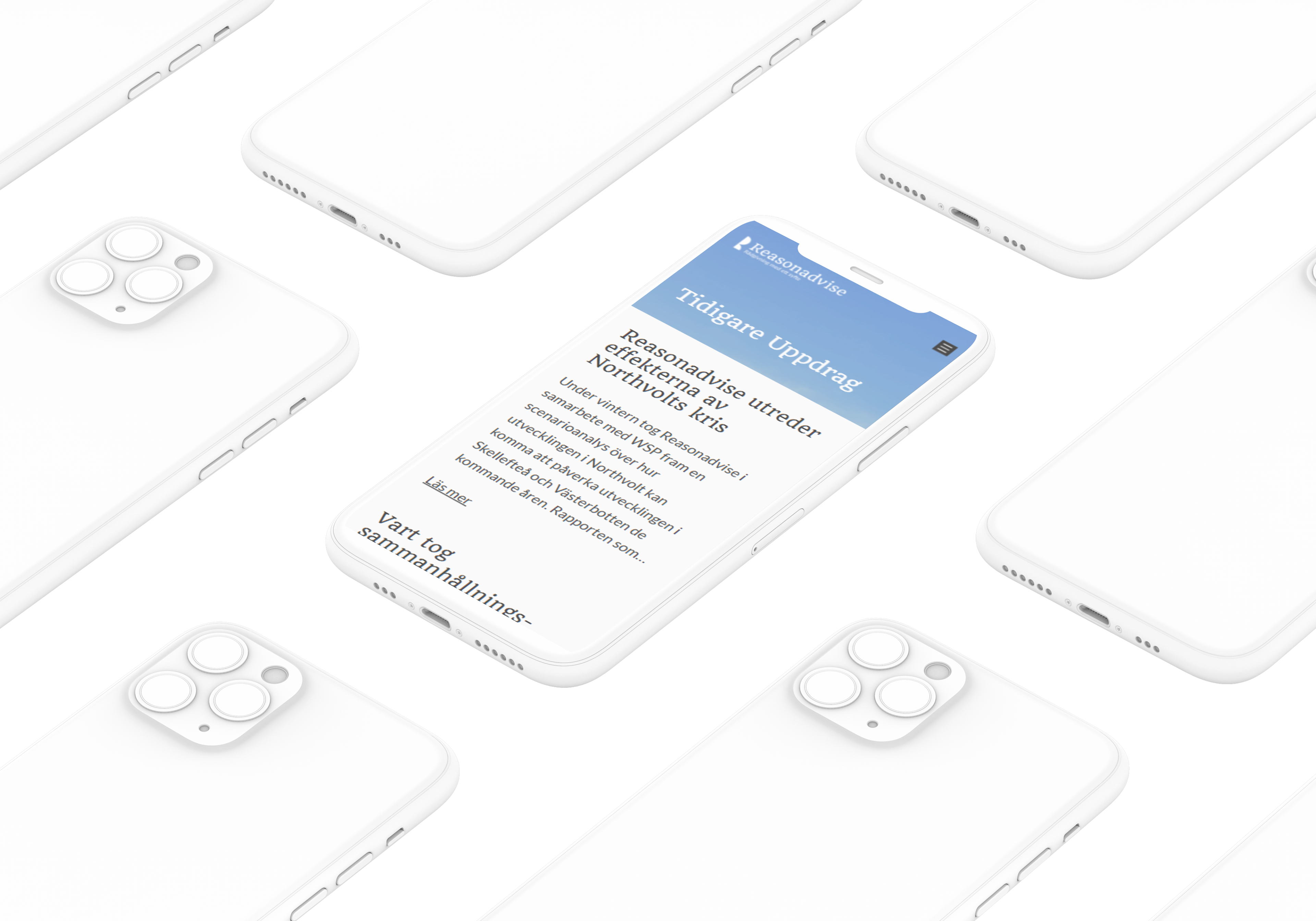
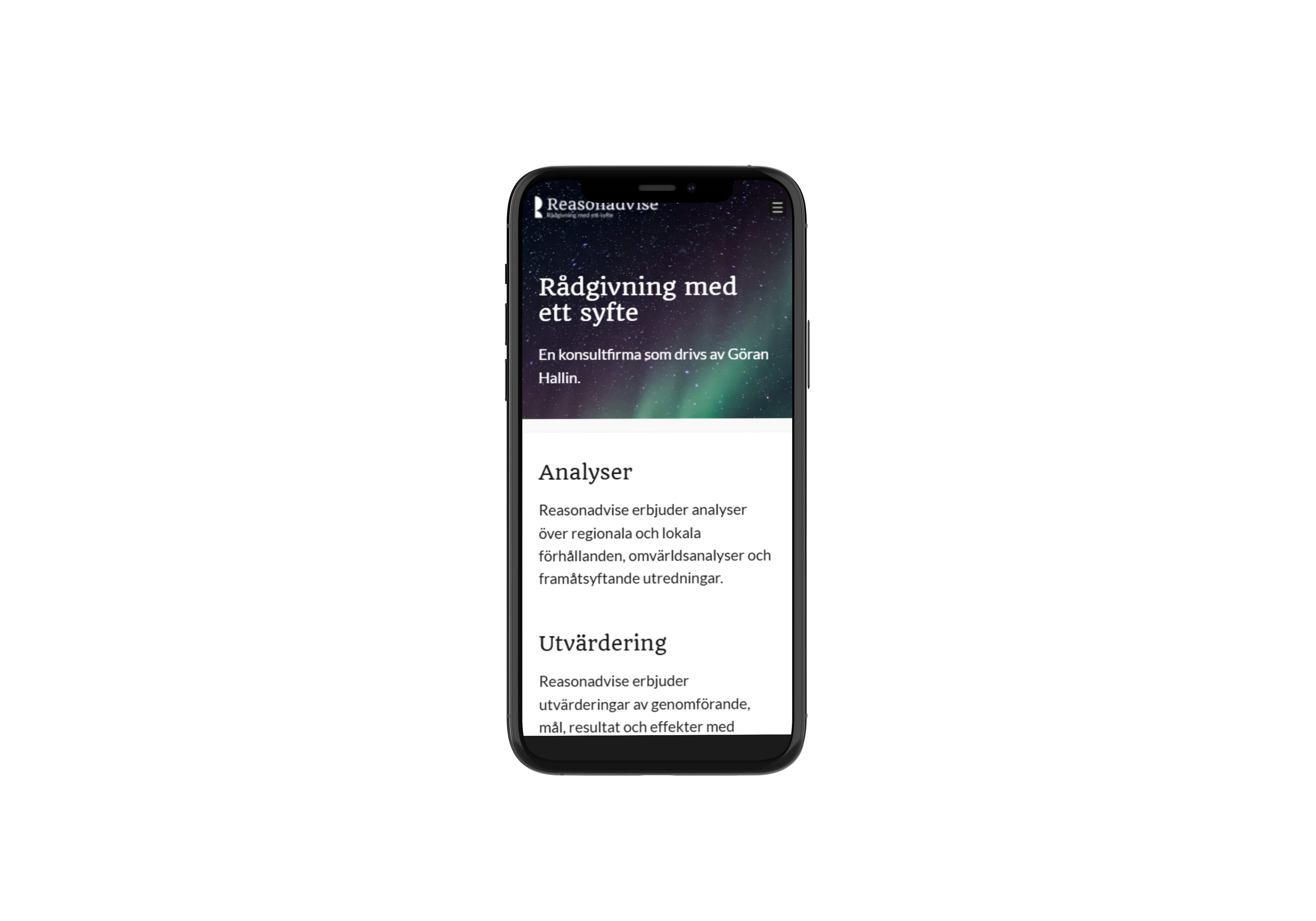
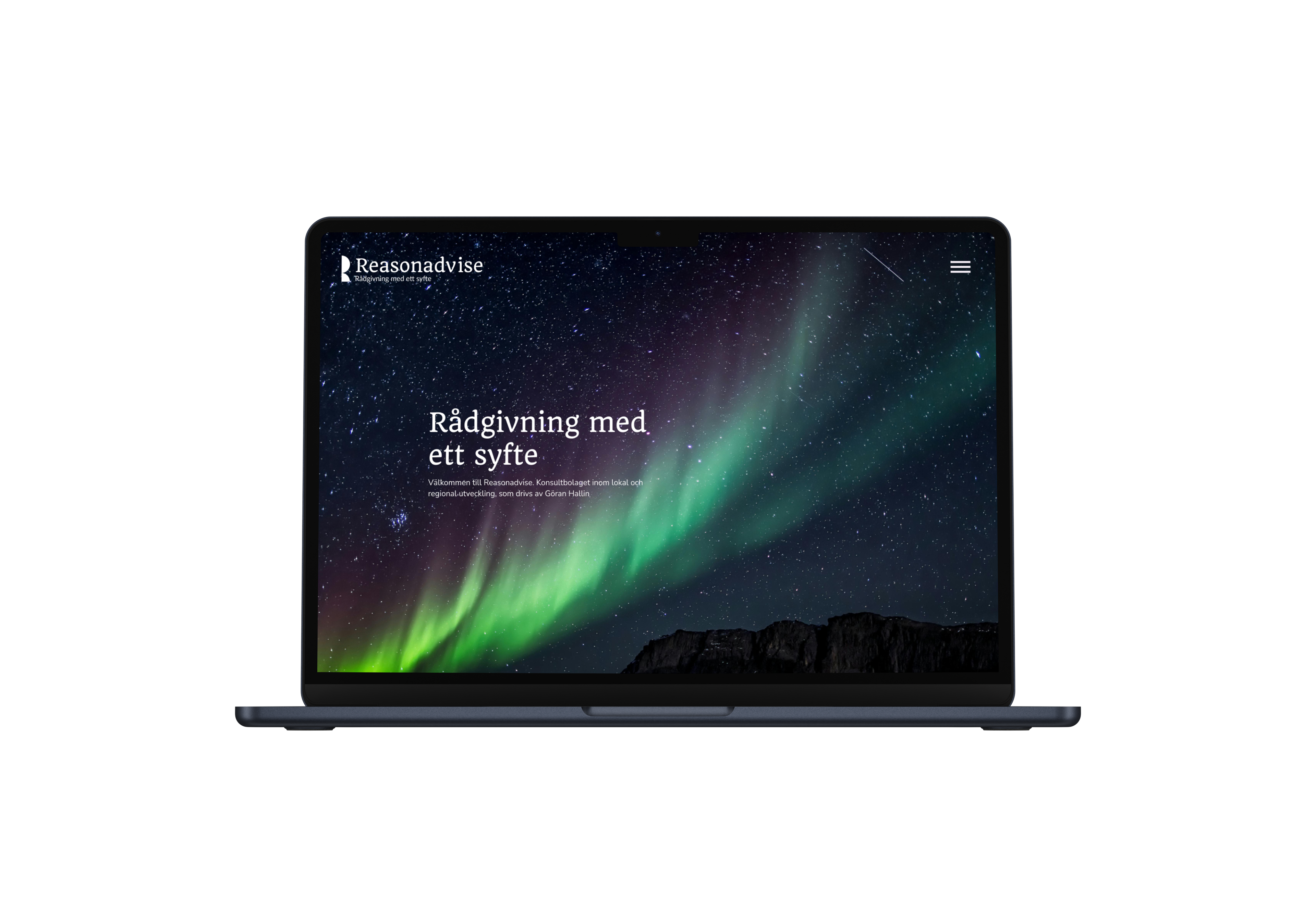
I designed Reasonadvise’s website to reflect the company’s values: reliability, experience, and purposeful advice. The design uses a calm, confident visual language - clean typography, strong contrast, and a natural color palette, to create a sense of trust.
I chose WordPress for its simplicity and maintainability, making it easy for the client to update content without technical barriers. Accessibility and functionality were priorities from the start: the site is fully responsive, meets WCAG contrast guidelines, and keeps navigation intuitive.
The end result is a digital presence that feels grounded and professional, while staying easy to use for both the client and their audience.
Visual Identity
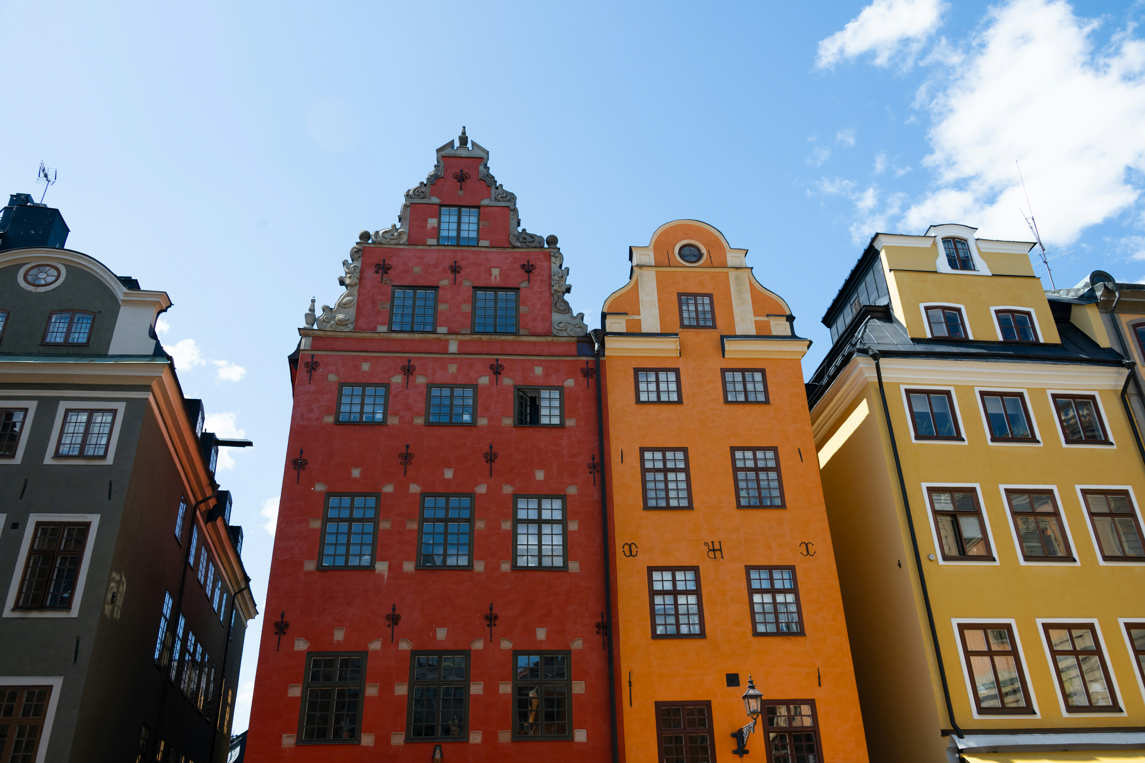
When I designed the visual identity, I wanted it to feel like the business itself — rooted in both northern Sweden and Stockholm. The northern landscapes bring a sense of stability, connection, and long-term thinking, while the urban elements add structure, modernity, and a forward-looking edge.
That combination reflects the work in regional development and sustainable leadership: grounded in local context, yet shaped by innovation and broader perspectives.